Choosing a Reel Cover That Survives the Grid Crop
SchedulifyX Team · September 22, 2026
Ensure your Instagram Reel thumbnail looks flawless on your profile grid. Learn the exact reel cover size, safe zones, and design tips for a perfect 9:16 cover.
You have spent hours conceptualising, filming, and editing the perfect video. The transitions are seamless, the audio is perfectly synced, and the value provided is exceptional. Yet, when you finally publish your masterpiece, you navigate to your profile only to find that the central text of your carefully chosen image has been unceremoniously decapitated by the profile grid crop. It is a frustrating experience shared by many content creators and social media managers.
When visitors land on your profile, your grid serves as your digital storefront. A cohesive, visually appealing grid encourages visitors to explore your content further, while a disorganised grid with poorly cropped images can create a disjointed user experience. The primary culprit behind this disjointed look is a misunderstanding of the optimal reel cover size and how it translates across different viewing environments within the application.
In this comprehensive guide, we will explore the mechanics of the grid crop, detail the exact dimensions you need to succeed, and provide actionable design strategies to ensure your Instagram reel thumbnail looks professional, engaging, and perfectly aligned, no matter where it is viewed. By mastering the 9 16 cover format and its safe zones, you can maintain a pristine profile aesthetic.
Understanding the Native Reel Cover Size
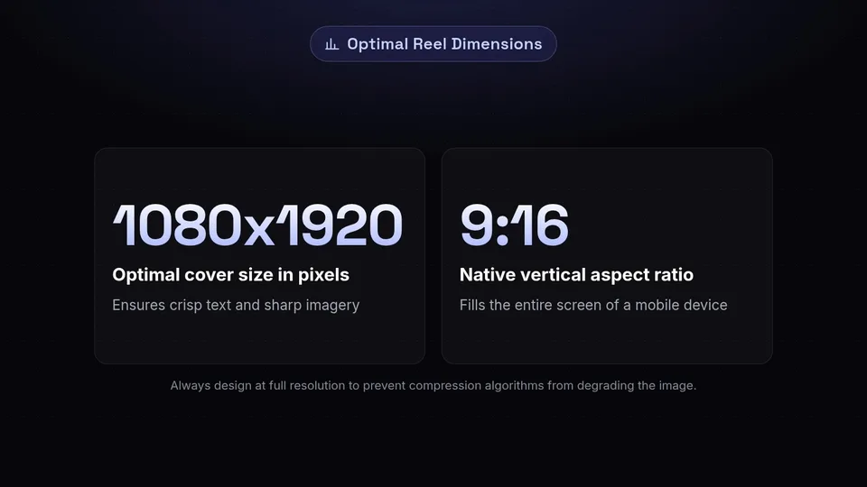
To solve the problem of the grid crop, we must first understand the canvas we are working with. The native format for short-form video content on modern social platforms is vertical. Consequently, the optimal reel cover size matches this vertical orientation.
The standard dimensions for a 9 16 cover are 1080 pixels in width by 1920 pixels in height. This aspect ratio is designed to fill the entire screen of a standard mobile device, providing an immersive, distraction-free viewing experience. When a user is scrolling through the dedicated Reels tab, this is exactly what they see: your cover image displayed in its full, uncropped glory.
However, designing solely for this full-screen experience is where many creators fall into a trap. While your text and graphics might look perfectly balanced when spread across the entire 1080 by 1920 canvas, this design approach completely ignores the structural reality of the main profile grid.
The Role of Resolution
Before moving on to the crop, it is crucial to discuss resolution. Always design your covers at the full 1080 x 1920 resolution. If you attempt to use smaller dimensions that technically share the 9:16 ratio (such as 720 x 1280), the platform's compression algorithms will stretch and degrade your image. A high-resolution starting point ensures that your text remains crisp and your imagery stays sharp, which is vital for readability on smaller mobile screens.
The Mechanics of the Grid Crop
The core of the issue lies in how the platform categorises and displays content. While videos are vertical, the traditional profile grid is built entirely on squares. This 1:1 aspect ratio is a legacy of the platform's origins as a square-photo sharing application. To make a vertical 9 16 cover fit into a square grid, the application must crop the image.
The crop is not random; it is a precise, mathematically predictable mechanism. The platform automatically takes a 1:1 square directly from the exact vertical centre of your 1080 x 1920 image. It does not scale the image down to fit the square; it simply slices off the top and bottom portions of your Instagram reel thumbnail.
The Three Viewing Environments
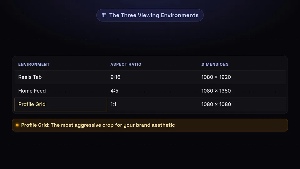
To fully grasp the importance of this, you must consider the three primary ways users will encounter your cover image:
- The Reels Tab: Here, users see the full reel cover size (1080 x 1920 pixels, 9:16 ratio). There is no cropping, but platform interface elements (like the creator's handle, caption preview, and engagement buttons) will overlay the bottom and right-hand sides of the screen.
- The Home Feed: When your video appears in a follower's standard home feed, the cover is often cropped to a 4:5 aspect ratio (1080 x 1350 pixels). This chops a small amount off the top and bottom.
- The Profile Grid: This is the most aggressive crop. When viewed on your main profile page, the cover is reduced to a 1:1 square (1080 x 1080 pixels).
Because the profile grid is the primary place where users judge your overall brand aesthetic, designing for this 1:1 centre crop is non-negotiable if you want to maintain a professional appearance.
Calculating and Using the Safe Zone
Now that we know the platform will extract a 1080 x 1080 pixel square from the centre of our 1080 x 1920 pixel image, we can calculate the exact "safe zone" for our Instagram reel thumbnail.
If we take the total height of 1920 pixels and subtract the 1080 pixels that will be displayed on the grid, we are left with 840 pixels. Because the crop is perfectly centred, we divide this remainder by two. This gives us 420 pixels.
Therefore, the top 420 pixels and the bottom 420 pixels of your 9 16 cover are in the "danger zone." Anything placed in these areas will be completely invisible on your profile grid.
Setting Up Your Design Canvas
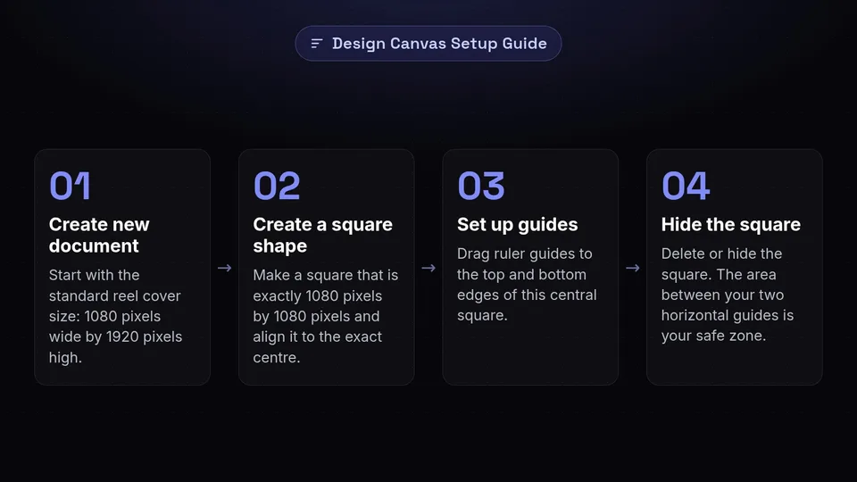
Whether you are using professional graphic design software or browser-based design tools, you can easily set up a template to ensure you never violate the safe zone. Here is a reliable method to create your own guide:
- Create a new document with the standard reel cover size: 1080 pixels wide by 1920 pixels high.
- Create a square shape that is exactly 1080 pixels by 1080 pixels.
- Align this square to the exact vertical and horizontal centre of your canvas.
- Drag ruler guides to the top and bottom edges of this square.
- You can now delete or hide the square. The area between your two horizontal guides is your safe zone.
Whenever you design a new cover, ensure that all critical information—such as your video title, key graphics, and the focal point of any faces—sits entirely within this central area.
Design Principles for a Flawless Thumbnail

Understanding the safe zone is only the first step. Creating an Instagram reel thumbnail that actually drives engagement while surviving the crop requires strategic design choices. Your cover needs to capture attention quickly, communicate the video's value, and align with your broader brand identity.
Typography and Readability
Text is often the most important element of your cover, as it provides immediate context for the video. However, text that is difficult to read is entirely ineffective.
First, ensure your font size is large enough to be legible on a mobile screen. Remember that the 1:1 square on your profile grid is displayed quite small on a smartphone. If your text is too thin or too small, it will become an unreadable blur.
Second, choose fonts that align with your brand but prioritise legibility. Sans-serif fonts are generally easier to read on digital screens than complex cursive or heavily stylised serif fonts. If you use a decorative font for brand consistency, reserve it for a few key words and use a highly legible sans-serif font for the rest of the title.
Third, maximise contrast. Place light text on dark backgrounds, or dark text on light backgrounds. If your background image is busy or features varied colours, use a solid colour block, a drop shadow, or a gradient overlay behind your text to ensure it stands out clearly.
Imagery and Focal Points
Human beings are naturally drawn to faces. If your video features a person speaking to the camera, using a clear, expressive frame of their face as part of the cover is a highly effective strategy. Ensure that the person's eyes and mouth are situated comfortably within the 1080 x 1080 safe zone.
If you are using graphics or product photography, the same rule applies. The most important visual element must be central. Avoid placing key visual details near the edges of the safe zone, as the visual tension can make the image feel cramped when viewed on the grid.
Utilising the Danger Zones Strategically
Just because the top 420 pixels and bottom 420 pixels will be cropped on the grid does not mean they should be left blank. These areas will still be visible when the video is recommended in the Reels tab.
Instead of leaving them empty, use these spaces for secondary visual elements that enhance the full-screen experience but are not strictly necessary for understanding the video's context. You might extend your background image into these areas, add subtle ambient patterns, or include secondary branding elements like a small logo or website URL. Just ensure that the loss of these elements on the profile grid does not negatively impact the overall design.
Custom Uploads vs. Video Frames
When publishing your content, you are presented with two options for your 9 16 cover: you can either slide through the video timeline to select a specific frame, or you can upload a custom image from your camera roll. Both methods have their place, but one offers significantly more control.
Selecting a Frame from the Video
Choosing a frame directly from the video is the quickest method. It requires no additional design work and ensures the cover is an authentic representation of the video content. However, this method presents several distinct challenges.
Firstly, videos are in constant motion. Finding a frame where the subject is in focus, making a pleasant expression, and not blurred by movement can be incredibly difficult. Secondly, unless you specifically framed your video shoot with the 1:1 centre crop in mind, it is highly likely that the subject's face or key visual elements will fall outside the safe zone. Finally, you cannot add custom text to a selected video frame unless you edited that text directly into the video file itself.
Uploading a Custom Cover
Uploading a custom-designed image is the preferred method for maintaining a professional grid aesthetic. A custom upload gives you total control over the reel cover size, the typography, the branding, and most importantly, the safe zone.
By designing a custom cover, you can combine a high-quality still photograph with clear, legible text, all perfectly positioned to survive the grid crop. This method ensures consistency across your profile, allowing you to use specific brand colours and templates that make your content instantly recognisable to your audience.
How to Preview and Test Your Cover
Even with careful planning and the use of templates, it is always wise to test your Instagram reel thumbnail before publishing. A small miscalculation in your design software can lead to a misaligned grid, and spotting the error before it goes live will save you from having to delete and republish your content.
Using the Native Profile Grid Preview
The platform provides a native tool specifically designed to help you avoid cropping disasters. When you are in the final stages of publishing your video, after you have selected or uploaded your cover image, look for the option labelled "Profile grid."
Tapping this option will display exactly how your 9 16 cover will be cropped to a 1:1 square on your profile. More importantly, it allows you to adjust the crop. You can tap and drag the image slightly up or down to ensure the most important elements are perfectly centred within the square. If you find that you cannot adjust the image enough without cutting off vital text, it means your design violated the safe zone, and you will need to revise the image in your design software.
Using Third-Party Grid Planners
For creators who want to see how a new cover will look alongside their existing content, third-party grid planning applications can be invaluable. These tools allow you to upload your proposed cover image and view it in a mock-up of your actual profile grid.
This is particularly useful if you are trying to maintain a specific visual pattern, such as a checkerboard layout, or if you want to ensure that the colours of your new cover do not clash with the videos published immediately before it. By visualising the broader context, you can make informed decisions about your overall aesthetic strategy.
Updating Covers on Existing Content
A common question among creators who are just learning about the reel cover size safe zone is whether they can fix the poorly cropped videos currently sitting on their profile grid.
The platform's features evolve continuously, and the ability to edit content post-publication has historically been limited. Currently, the platform does allow users to edit the cover image of a published video. To do this, you navigate to the published video, access the menu options, select "Edit," and then tap on the cover image to upload a new one or select a different frame.
This functionality is a significant relief for those looking to rebrand or tidy up their existing grid. You can take your time to design new, properly formatted covers using the 1080 x 1080 safe zone, and systematically update your older content to create a cohesive, professional storefront. However, it is always best practice to get the cover right the first time to ensure maximum impact during the initial algorithmic push.
Conclusion
Navigating the transition from a vertical 9 16 cover to a square profile grid does not have to be a source of frustration. By understanding the native reel cover size and respecting the mathematics of the central 1080 x 1080 pixel safe zone, you can ensure that your content looks impeccable in every viewing environment.
Remember that your Instagram reel thumbnail is often the deciding factor in whether a user chooses to watch your video or scroll past. A poorly cropped image with cut-off text signals a lack of attention to detail, while a perfectly centred, highly legible cover communicates professionalism and value.
Take the time to set up reliable design templates, prioritise clear typography and high contrast, and always utilise the native preview tools before hitting publish. Managing a consistent publishing schedule while maintaining high design standards requires the right workflow. Streamline your content strategy and schedule your flawlessly designed videos with confidence using SchedulifyX, ensuring your grid always represents the very best of your brand.