Ultimate Carousel Post Design Guide for Instagram & LinkedIn
SchedulifyX Team · July 26, 2026
Learn how to design high-engagement carousel posts for Instagram and LinkedIn without design skills. Master Canva templates, proven frameworks, and CTA slides.
If you have been scrolling through Instagram or LinkedIn recently, you have undoubtedly noticed a massive shift in the type of content dominating your feed. Single images and short text updates are taking a backseat to a much more engaging, value-packed format: the carousel. Mastering carousel post design has become one of the most highly sought-after skills for marketers, creators, and business owners alike. But what if you have absolutely no background in design?
The good news is that you do not need a degree in graphic design or expensive software to create swipe-worthy, high-converting carousels. With the right frameworks, an understanding of basic visual principles, and free tools like Canva, anyone can design carousels that stop the scroll, educate their audience, and drive massive engagement.
In this comprehensive guide, we will walk you through a complete, beginner-friendly tutorial on creating stunning carousels for both Instagram and LinkedIn. We will cover proven copywriting frameworks, swipe-worthy layouts, hook slides, call-to-action (CTA) strategies, and how to schedule your masterpieces using an AI-powered tool like SchedulifyX.
Why Carousel Post Design is a Game-Changer
Before diving into the technical "how-to," it is crucial to understand exactly why you should be investing your time into carousel post design. Social media platforms are constantly evolving, but their core objective remains the same: keep users on the platform for as long as possible. Carousels play perfectly into this algorithmic desire.
The Algorithm Loves Dwell Time
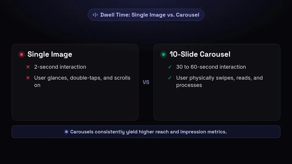
Dwell time—the amount of time a user spends looking at a specific piece of content—is a massive ranking factor on both Instagram and LinkedIn. When you post a single image, a user might glance at it for two seconds, double-tap, and scroll on. However, when you post a 10-slide carousel, the user has to physically swipe through each slide, read the text, and process the information. This can easily turn a two-second interaction into a 30-second or even one-minute interaction.
When the algorithm sees users spending significant time on your post, it flags your content as high-quality and pushes it out to a broader audience. This is why carousels consistently yield higher reach and impression metrics compared to standard static posts.
Storytelling and Value Packing
Beyond algorithmic benefits, carousels offer a unique canvas for storytelling. You cannot easily teach a complex concept or tell a nuanced story in a single graphic. A carousel acts like a mini-presentation or a micro-blog. It allows you to break down complex ideas into bite-sized, digestible pieces. This format builds trust and authority. When your audience consistently learns from your carousels, they begin to view you as an industry expert, making them much more likely to engage with your call-to-action.
The Anatomy of a High-Converting Carousel
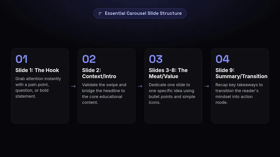
Great carousel post design is not just about making things look pretty; it is about structuring information in a way that guides the reader from the first slide to the last. Every high-converting carousel follows a specific anatomical structure. Let us break down the essential slides.
The Hook Slide (Slide 1)
Your first slide is the most important part of your carousel. If your hook fails, the rest of your brilliant design and valuable content will never be seen. The hook slide needs to grab attention instantly. It should address a specific pain point, ask a compelling question, or make a bold statement.
- Example 1 (Pain Point): "Why your Instagram growth has flatlined (and how to fix it)."
- Example 2 (Bold Statement): "Stop using Linktree in your bio. Do this instead."
- Example 3 (Curiosity): "The 3-step framework I used to double my LinkedIn reach."
Visually, the hook slide should have large, highly readable text, high contrast, and minimal clutter. You want the user's eye to go straight to the headline.
The Context/Introduction (Slide 2)
Once you have hooked the reader, slide two needs to validate their decision to swipe. This is where you provide context, agitate the pain point slightly, or introduce the solution you are about to share. Think of this as the bridge between the catchy headline and the actual educational content. Keep it brief—one or two short sentences are usually enough.
The Meat/Value (Slides 3-8)
This is where you deliver on the promise made in your hook. Break your core message down into logical steps or points. Dedicate one slide to one specific idea. A common mistake in social media graphic design is cramming too much text onto a single slide. If you have a lot to say, spread it out over multiple slides.
Use bullet points, bold text for emphasis, and simple icons or graphics to support your text visually. The goal is to make the information as easy to scan and digest as possible.
The Summary/Transition (Slide 9)
Before you hit them with a call-to-action, it is often helpful to summarize the key takeaways. A quick recap slide reinforces the value you just provided and smoothly transitions the reader's mindset from "learning mode" to "action mode."
The CTA Slide (Slide 10)
Never leave your audience hanging. What do you want them to do after reading your carousel? The final slide must contain a clear, singular Call-To-Action (CTA). Do you want them to save the post for later? Follow you for more tips? Click the link in your bio? Leave a comment?
Pick one primary action. If you ask them to like, comment, share, save, and click your link, they will likely suffer from decision fatigue and do nothing. Visually highlight the CTA using arrows, bold buttons, or contrasting colors.
Proven Carousel Frameworks for Any Niche

Staring at a blank canvas can be intimidating. To speed up your content creation process, you should rely on proven copywriting and structural frameworks. Here are four frameworks that work exceptionally well for carousel post design across various industries.
1. The "How-To" Step-by-Step Guide
This is the most common and highly saved type of carousel. It is purely educational and highly actionable.
- Slide 1: Hook ("How to achieve [Desired Result] in [Timeframe]")
- Slide 2: Why this method works / The common mistake people make.
- Slides 3-7: Step 1, Step 2, Step 3, etc.
- Slide 8: Common roadblock and how to overcome it.
- Slide 9: Summary of steps.
- Slide 10: CTA (e.g., "Save this post for your next project!")
2. The "Myth vs. Reality" Breakdown
This framework is excellent for establishing authority and disrupting your industry's standard narrative.
- Slide 1: Hook ("3 Lies you've been told about [Industry Topic]")
- Slide 2: Introduction to the misconceptions.
- Slide 3: Myth #1
- Slide 4: The Reality (Truth behind Myth #1)
- Slide 5: Myth #2
- Slide 6: The Reality
- Slide 7: Myth #3
- Slide 8: The Reality
- Slide 9: Core takeaway message.
- Slide 10: CTA (e.g., "Which of these surprised you the most? Tell me below!")
3. The "Listicle" or Resource Roundup
People love curated lists of tools, books, podcasts, or resources. They are highly shareable and save the reader time.
- Slide 1: Hook ("Top 5 free tools for [Specific Task]")
- Slide 2: Why you need these tools.
- Slides 3-7: Tool 1, Tool 2, Tool 3 (include a screenshot and a 1-sentence benefit for each).
- Slide 8: Honorable mentions.
- Slide 9: My personal favorite from the list.
- Slide 10: CTA (e.g., "Share this with a friend who needs these tools!")
4. The Case Study/Transformation Story
If you are selling a service or product, case studies are powerful social proof. Carousels allow you to tell the story visually.
- Slide 1: Hook ("How we helped [Client] achieve [Massive Result]")
- Slide 2: The Client's original problem/pain point.
- Slide 3: The obstacles they faced.
- Slide 4: Our strategy/The solution we implemented.
- Slide 5-7: The execution (show behind-the-scenes or data).
- Slide 8: The final result/ROI.
- Slide 9: Testimonial quote from the client.
- Slide 10: CTA (e.g., "Want results like this? DM me 'GROW' to get started.")
Step-by-Step Instagram Carousel Tutorial Using Canva
Now that you know what to write, let us get into the actual design. You do not need Adobe Illustrator or Photoshop. This instagram carousel tutorial will focus on Canva, the most accessible and powerful free design tool available today.
Setting Up Your Canvas for Seamless Carousels
There are two ways to design a carousel in Canva: slide-by-slide (standard) or as one long, continuous image that you slice up later (seamless). Seamless carousels are incredibly engaging because graphic elements bleed from one slide to the next, psychologically encouraging the user to keep swiping.
Here is how to set up a seamless carousel:
- Calculate your dimensions: The optimal size for an Instagram portrait post is 1080 pixels wide by 1350 pixels tall. If you want a 5-slide seamless carousel, multiply the width (1080) by 5. Your custom dimensions in Canva will be 5400px wide by 1350px tall.
- Create the design: Go to Canva, click "Create a design," select "Custom size," and enter your calculated dimensions.
- Set up your guides: To know where one slide ends and the next begins, you need guides. Go to File > View settings > Show rulers and guides. Drag vertical guides from the left ruler and drop them at 1080px, 2160px, 3240px, and 4320px. Now you have 5 distinct panels on your canvas.
Leveraging Canva Carousel Templates
If the seamless method feels too advanced, or if you are short on time, Canva carousel templates are your best friend. Canva has thousands of pre-designed, multi-page templates.
- Open Canva and search for "Instagram Carousel" in the template search bar.
- Filter by your brand's aesthetic (e.g., minimalist, bold, corporate, playful).
- Select a template that has multiple pages.
- Click "Apply all pages" to load the entire carousel into your workspace.
The beauty of templates is that the visual hierarchy, font pairings, and layout are already done for you by professional designers. All you need to do is swap out the text and colors.
Customizing Fonts, Colors, and Branding
To make a template your own, you must apply your brand guidelines. Consistency is key in social media graphic design. When someone sees your carousel in their feed, they should instantly recognize it as yours before they even read your handle.
- Colors: Stick to a palette of 3-5 colors. Use a dominant background color, a highly contrasting text color, and an accent color for highlights, arrows, and your CTA.
- Fonts: Do not use more than two fonts. Pair a bold, attention-grabbing font for your headlines with a clean, highly readable sans-serif font for your body text.
- Brand Elements: Always include your logo or social media handle on every slide (usually small, in the bottom center or corner). This protects your content if it gets shared or reposted.
Exporting and Slicing Your Design
If you used the standard multi-page template method, simply click Share > Download > PNG and download all pages. You are ready to post.
If you designed a seamless, continuous image, you need to slice it before uploading it to Instagram. Download your long design as a high-quality PNG. Then, use a free online tool like PineTools (search "Split Image PineTools"). Upload your long image, select "Horizontally," input the number of blocks (e.g., 5), and click "Split Image." Download the individual files, and you now have a perfectly seamless carousel ready for Instagram!
Expert LinkedIn Carousel Tips for B2B Success
While Instagram carousels are uploaded as multiple image files, LinkedIn carousels are entirely different from a technical standpoint. On LinkedIn, to get the swipeable carousel format, you must upload a PDF document. This is often referred to as a "Document Post."
Here are essential linkedin carousel tips to ensure B2B success:
Why LinkedIn Carousels (PDFs) are Different
LinkedIn's algorithm heavily favors document posts because they keep professionals engaged and reading. However, the audience on LinkedIn is different from Instagram. They are looking for industry insights, career advice, leadership tips, and B2B strategies. Your design and tone should reflect a more professional, polished aesthetic.
Formatting for Professional Audiences
- Orientation: While landscape (1920x1080) works on LinkedIn, portrait orientation (1080x1350 or 1080x1080) is actually better because it takes up more vertical screen real estate on mobile devices, capturing more attention.
- Exporting: When designing in Canva, you must click Share > Download and change the file type from PNG to PDF Standard. This is a crucial step; if you upload images to LinkedIn, they will display as a grid, not a swipeable carousel.
- File Size: Keep your PDF under 100MB, though for social media, it should ideally be under 10MB for fast loading.
Balancing Text and Visuals in B2B
B2B audiences are willing to read slightly more text than Instagram users, but you must still avoid walls of text. Use data visualizations, charts, and infographics to break up complex business concepts. A well-placed pie chart or a simple graph showing growth will resonate deeply with a LinkedIn audience. Keep your tone authoritative yet conversational.
Essential Social Media Graphic Design Principles for Non-Designers
Even if you are using templates, understanding basic social media graphic design principles will elevate your carousels from amateur to professional. You do not need a degree, just an awareness of these three concepts.
The Rule of Thirds and Visual Hierarchy
Visual hierarchy is the arrangement of elements in a way that implies importance. You want to guide the viewer's eye exactly where you want it to go. Typically, this means:
- Headline: Largest font, placed at the top or center.
- Body Text: Medium font, placed below the headline.
- Additional details (handle, swipe arrow): Smallest font, placed at the margins.
Use the Rule of Thirds by mentally dividing your slide into a 3x3 grid. Place your most important elements (like a face, an icon, or a key word) at the intersections of these grid lines to create a balanced, aesthetically pleasing composition.
Contrast and Readability
Poor contrast is the number one reason carousels fail. If your audience has to squint to read your text, they will swipe away instantly. Always ensure there is high contrast between your text and your background.
- Dark text on a light background (e.g., Navy blue on off-white).
- Light text on a dark background (e.g., White on charcoal gray).
- Avoid placing text directly over busy photographs. If you must use a photo background, add a dark, semi-transparent overlay (a shape with lowered opacity) behind the text to make it pop.
Whitespace is Your Friend
Whitespace (or negative space) is the empty space around your text and graphics. Non-designers often feel the urge to fill every inch of the canvas. Resist this urge! Whitespace gives your design room to breathe, makes your content look more premium, and drastically improves readability. Give your text generous margins away from the edges of the slide.
Common Carousel Mistakes to Avoid
As you begin your carousel creation journey, watch out for these common pitfalls that can kill your engagement.
Too Much Text on One Slide
We have mentioned it, but it bears repeating. A carousel slide is not a novel. If a slide takes more than 5-7 seconds to read, it has too much text. Edit your copy ruthlessly. Cut out filler words. Use bullet points. If a concept is too long, split it into two slides.
Weak Hooks and Unclear CTAs
If your first slide says "Marketing Tips," nobody is going to swipe. It is too vague and boring. Rewrite it to "5 Marketing Tips that Generated
Inconsistent Branding
If slide 1 is neon pink with a bold font, and slide 2 is pastel blue with a cursive font, your audience will feel disjointed and confused. Consistency builds trust. Set up a Brand Kit in Canva and stick to your predefined fonts and colors for every single post.
Scheduling and Publishing Your Carousels with SchedulifyX
Designing the perfect carousel is only half the battle. To truly dominate social media, you need to post consistently and at the optimal times when your audience is active. Manually posting carousels every day is tedious and prone to error. This is where SchedulifyX comes in.
Automating Your Content Calendar
SchedulifyX is an AI-powered social media scheduling platform designed to make your life easier. Once you have exported your beautiful Canva designs (as images for Instagram or PDFs for LinkedIn), you can seamlessly upload them into SchedulifyX.
- Visual Calendar: Plan out your entire month of carousel content using our intuitive drag-and-drop calendar. Ensure you have a good mix of educational frameworks, case studies, and listicles.
- AI Caption Generation: Struggling to write the caption for your carousel? SchedulifyX features an integrated AI writer that can generate engaging captions and relevant hashtags based on the topic of your design.
- Optimal Timing: Our platform analyzes your past engagement data to suggest the absolute best times to publish your carousels, ensuring maximum reach and dwell time.
- Multi-Platform Publishing: Schedule your image carousel to Instagram and your PDF carousel to LinkedIn simultaneously from one unified dashboard.
By combining high-quality carousel post design with the automated power of SchedulifyX, you will build a consistent, professional, and highly engaging social media presence without spending hours glued to your phone.
Ready to take your social media strategy to the next level? Stop stressing over manual posting and let automation do the heavy lifting. Sign up for SchedulifyX today, schedule your newly designed carousels, and watch your engagement soar!